Guide
How to Create a Professional Brand Color Palette
Published
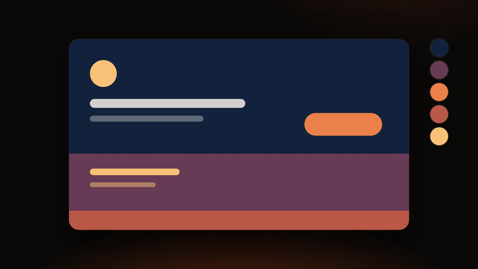
Most weak brand palettes fail for the same reason: they are lists of nice colors instead of systems with jobs. A professional palette says which color carries the brand, which one is for backgrounds, which one is for text, and which one is for the single thing you want people to click.
The short answer: choose a source of inspiration (a logo, a photo or a product), extract five to eight colors from it, give each color a role, test the text/background pairs for contrast, then save the palette as CSS variables and a swatch file so everyone uses the same values. You can do the extraction, role-checking and export in the DailyBox Color Palette Extractor without uploading your image.
Step 1: Decide what the palette should say
Before opening any tool, write three adjectives for the brand (for example: calm, precise, warm). Colors carry associations, but those vary by culture and context, so treat them as hypotheses to test with your audience, not as rules. Look at the colors your competitors use too, not to copy them, but to avoid blending in.
Step 2: Choose a source image
Good sources:
- A product or packaging photo. The palette will already match what customers see.
- A mood image that captures the feeling you wrote down in step 1.
- An existing logo. Use the original PNG or SVG (not a screenshot) so the colors are exact.
Avoid busy images with many unrelated colors; they produce palettes without a clear center. If you have to use one, crop to the area that represents the brand.
Step 3: Extract the colors
Open the image in the Color Palette Extractor and start with eight colors. Then:
- Turn on ignore white or ignore black if the image has large empty areas.
- Raise variety to merge near-duplicates; lower it if a small accent color is vanishing.
- Lock colors you are sure about and regenerate to explore alternatives for the rest.
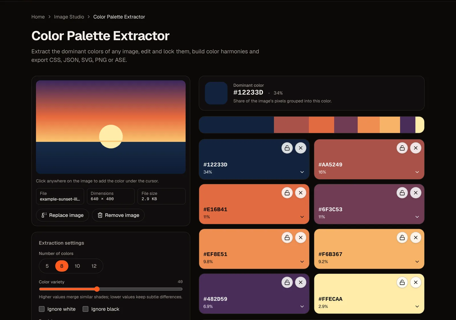
Extracted colors show the share of the image they cover. Do not confuse area with importance: a brand's accent color is often a small part of the source image.
Step 4: Give every color a job
A practical structure is five roles:
| Role | What it does | How to choose it |
|---|---|---|
| Primary | The color people associate with you (logo, key headings, main buttons) | Usually a mid-saturated color with enough contrast against white or dark backgrounds |
| Secondary | Supporting color for sections, icons, charts | A color related to the primary |
| Accent | The call-to-action color | The most vivid color in the palette, used sparingly |
| Neutral light / dark | Backgrounds, text, borders | Tints and shades near your primary hue, so grays do not feel foreign |
| Feedback (optional) | Success, warning, error | Keep recognizable conventions (green, amber, red) and test them against your palette |
Many designers use the 60-30-10 rule of thumb: roughly 60% dominant (usually neutrals), 30% secondary, 10% accent. It is a starting point, not a law.
A worked example
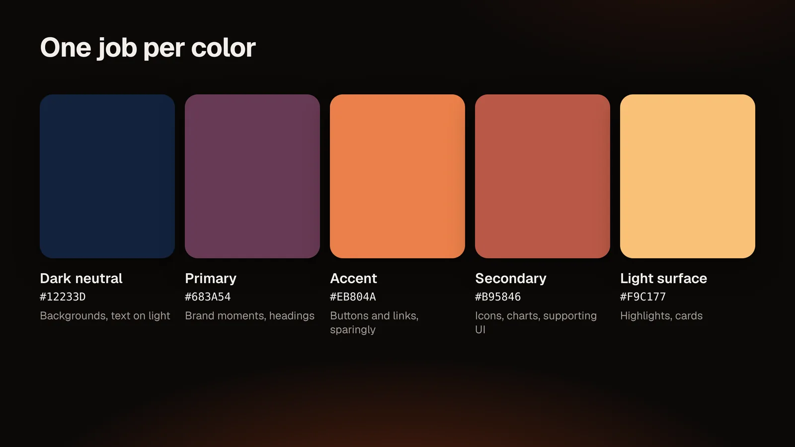
We loaded a sunset illustration into the tool and asked for five colors. The results were #12233D (deep navy, 34% of the image), #683A54 (plum, 21%), #EB804A (orange, 18%), #B95846 (clay, 15%) and #F9C177 (sand, 12%). One reasonable assignment:
| Role | Color | Why |
|---|---|---|
| Dark neutral / background | #12233D | It is the largest area and the darkest color |
| Primary | #683A54 | A calm, distinctive hue that is not already the background |
| Accent | #EB804A | The most energetic color, reserved for buttons and links |
| Light surface / highlight | #F9C177 | A warm light for highlights |
| Secondary | #B95846 | A related, muted red-brown for supporting elements |
Other assignments are valid; the point is that each color has one job.
Step 5: Test contrast
A palette that looks lovely but cannot be read is a failure. WCAG 2.x guidelines ask for a contrast ratio of at least 4.5:1 for normal-size text and 3:1 for large text (and for key interface components such as button borders).
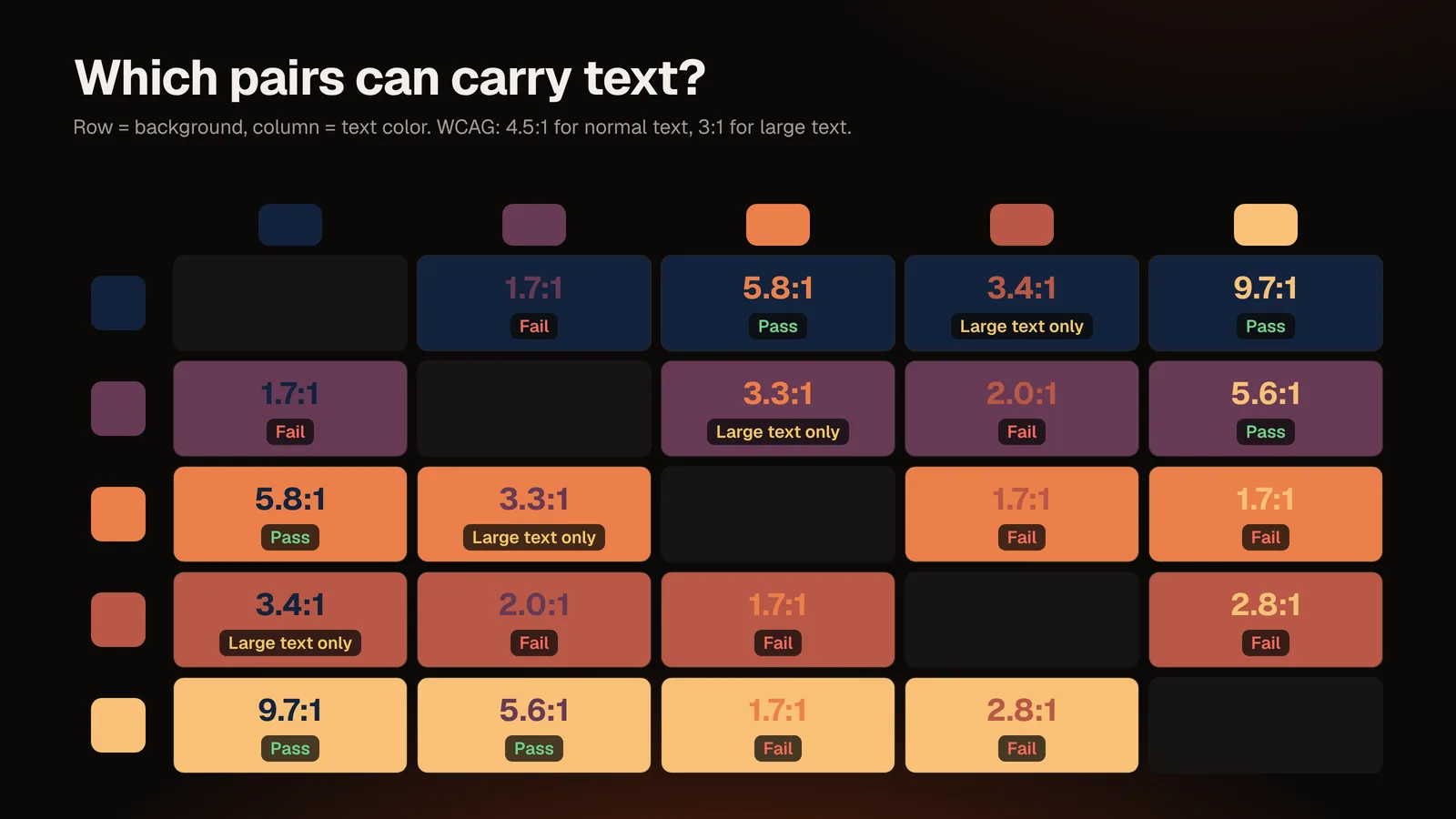
In our example, sand #F9C177 on navy #12233D measures about 9.7:1 and orange #EB804A on navy about 5.8:1, so both pass for normal text. Sand on plum #683A54 is about 5.6:1, which also passes. Orange on plum is only about 3.3:1, so it suits large text and interface components but not body copy, and plum on navy is about 1.7:1, which fails for text altogether. A palette can look harmonious and still contain pairs you must not use for text.
The tool shows each color on white and on black, and its optional AI consultant suggests text/background combinations. The consultant's output is filtered on your device so only pairs that reach 4.5:1 are kept. Still, verify any pair you ship in the real interface, at the real font size.
Step 6: Generate supporting shades
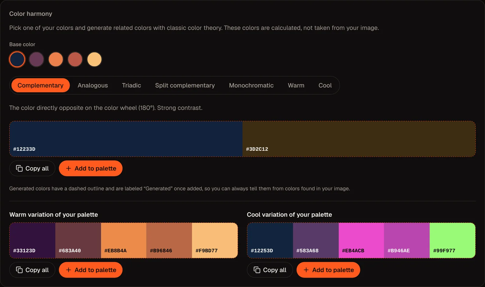
Brands need more than five flat colors: hover states, disabled states, tints for backgrounds. Use the harmony generator to explore monochromatic steps (lighter and darker versions of one color) for your primary, or complementary, analogous, triadic and split complementary options when you need a contrasting supporting color. The tool labels generated colors differently from extracted ones, so your palette stays honest about its origin.
Two cautions:
- Generated colors are mathematical suggestions. Look at them in context.
- Do not add colors just because a tool offers them. Fewer, better-defined colors beat a large palette.
Step 7: Name, document and export
Hand-over is where palettes usually fall apart. Export in the formats your team uses:
- CSS variables for developers, for example
--color-primary,--color-secondary,--color-accent, then numbered extras. - JSON for design tokens or scripts.
- PNG or SVG for brand guidelines and presentations.
- ASE for apps that import Adobe Swatch Exchange files. If an app rejects the file, use the CSS or JSON export instead.
Document for each color: name, role, HEX, RGB, and a CMYK value approved by your printer. The CMYK numbers in the tool are a simple conversion from RGB, so printed results depend on inks, paper and color profiles.
Step 8: Test in the real world
- Place the palette on your actual website, deck and packaging mock-ups.
- View on a phone in sunlight and on a laptop in a dark room.
- Check the palette in grayscale to see whether hierarchy survives without color.
- Ask people who do not know the brand what mood it conveys.
Mistakes to avoid
- Too many colors. Start with a small core; add only when a real need appears.
- Accent used everywhere. If everything is highlighted, nothing is.
- Pure black text on pure white can feel harsh; dark navy or charcoal often reads better. Test, do not assume.
- Relying on color alone to carry meaning (red/green status with no label or icon).
- Copying a competitor's exact palette.
- Skipping the print check for packaging and signage.
Conclusion
A professional palette is a small set of colors with defined jobs, tested for contrast and shared in formats people can use. Start from an image that already feels like your brand, extract, assign roles, test, and export.
Start building yours: open the Color Palette Extractor and drop in your logo or mood image. For single-color needs, see How to Pick HEX Colors from Any Image; for the extraction details, read How to Extract a Color Palette from an Image.
Notes: WCAG thresholds from W3C WCAG 2.x. Example colors come from a real run of the tool on a test illustration (shades can shift slightly between runs); contrast ratios were calculated from those HEX values. Color associations vary by culture and context.
Questions and answers
How many colors should a brand palette have?
Most brands work with three to six core colors: a primary, a secondary, an accent and a few neutrals. Add feedback colors for products with interfaces.
Can I create a brand palette from a photo?
Yes. Extract the dominant colors, assign roles, test contrast and adjust. Make sure you have the right to use the photo if it is also part of your branding.
What is the 60-30-10 rule?
A rule of thumb for proportion: about 60% of the design in a dominant color, 30% in a secondary color and 10% in an accent. Treat it as a starting point.
Is an AI palette generator better than extracting from an image?
They solve different problems. Extraction reports what is in your image. The tool's optional AI consultant works on top of already extracted HEX codes to suggest a name, mood, uses and readable pairs; it does not create the palette and the tool works fully without it.
How do I make sure the palette is accessible?
Test every text/background pair against WCAG contrast ratios (4.5:1 for normal text, 3:1 for large text) and do not rely on color alone.
Which file should I give my developer?
CSS variables or JSON, plus the HEX codes and role names in a short document.
Can the tool match my palette to Pantone?
No. It outputs HEX, RGB, HSL and CMYK values. For Pantone or paint matching, use the manufacturer's tools and request a physical proof.