Guide
How to Extract a Color Palette from an Image
Published
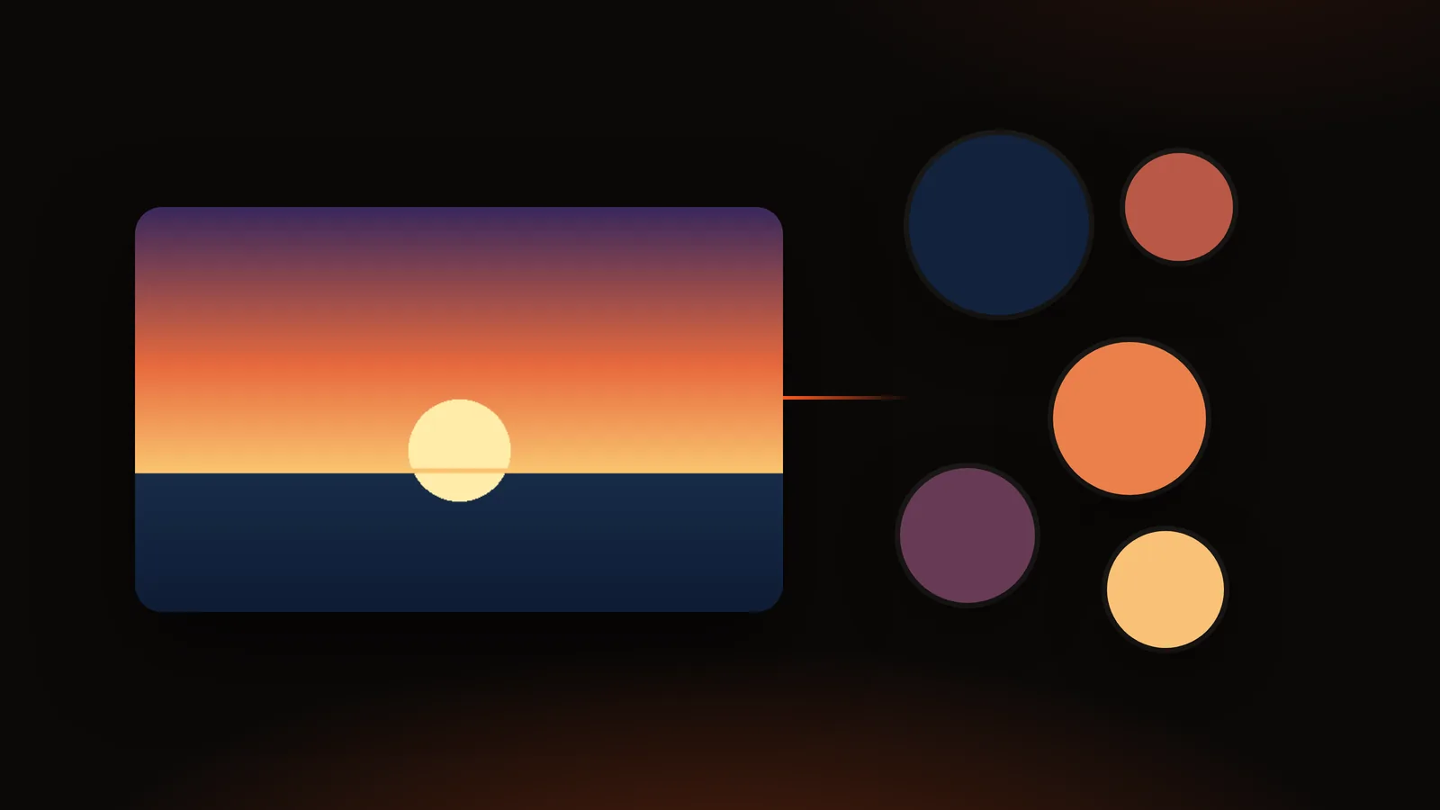
A good photo already contains a color scheme that works. The sky and the sea, the jacket and the wall behind it: those colors sit together because the scene put them together. Extracting a palette means asking software to list the main colors of the picture so you can reuse them in a logo, a slide deck, a website or a painting reference.
The short answer: open an image in a palette extractor, choose how many colors you want (5 to 12 is the usual range), check that the result looks right, then copy the HEX codes or export them as CSS variables, JSON or an image. With the DailyBox Color Palette Extractor that takes four steps, and the picture is processed in your browser instead of being uploaded.
The rest of this guide explains what the numbers mean, how to get a palette you actually like, and what to do when the first result looks dull.
What "extracting a palette" really does
A photo can contain hundreds of thousands of different pixel colors. A palette extractor groups pixels that look alike and reports one representative color for each group. The groups are found with a clustering method: pixels are compared by how different they look to the human eye, nearby shades are merged, and the biggest groups win.
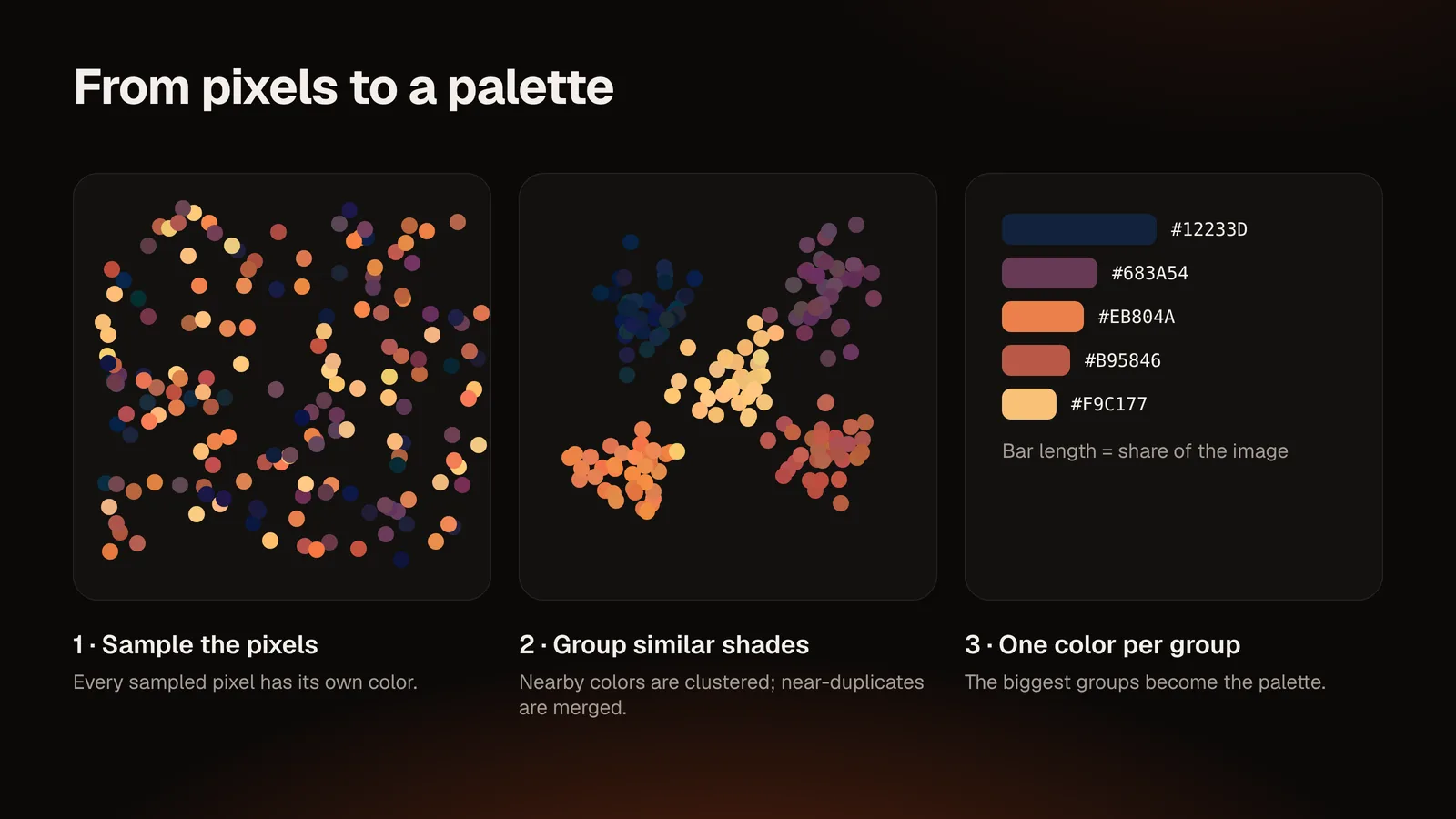
Two consequences are worth knowing:
- The palette depends on the picture's proportions. A landscape that is 60% sky will list sky tones first. That is accurate, but it may not be the colors you find most interesting.
- Extraction is not the same as picking. Picking reads one pixel. Extracting summarizes many. If you need the exact color of one logo or one flower, use a picker (see How to Pick HEX Colors from Any Image).
Step by step: extract a palette from an image
1. Open your image
Drag the file onto the tool or use the browse button. The extractor accepts the formats your browser can decode, such as PNG, JPG, WebP, GIF, AVIF, BMP and SVG. The tool shows the file name, dimensions and size so you can confirm you loaded the right file.
Because the work happens locally, nothing is sent to a server to extract the colors. That matters if the image is a client's unreleased design.
2. Choose how many colors
The tool offers 5, 8, 10 or 12 colors, and you can add or remove individual colors afterwards.
| Colors | Good for |
|---|---|
| 5 | A quick brand or slide palette; the main mood of the image |
| 8 | UI work: background, surface, text, accent and a few supporting shades |
| 10–12 | Illustration, mood boards, reference palettes with subtle shades |
If you are unsure, start with 8 and delete what you do not need. Removing a color is faster than guessing which one is missing.
3. Adjust the settings if the result looks off
Three settings change how the palette is built:
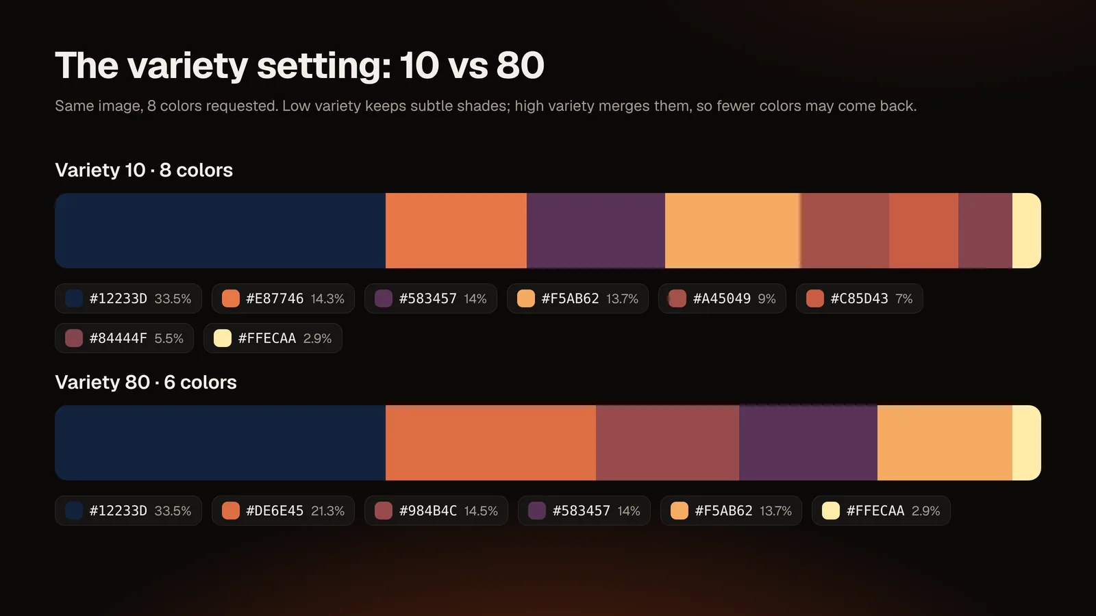
- Variety. Higher values merge similar shades into one; lower values keep subtle differences. If your 8 colors look like four colors repeated, raise it. If a distinct accent color disappeared, lower it.
- Ignore white / ignore black. Product shots on a white background will list white first. Turning on "ignore white" removes it so the product's colors come through. The same applies to black borders.
- Precision. The image is sampled at 128, 256 or 512 pixels before analysis. Fast is fine for most photos; Detailed helps when a small but important detail (a logo on a shirt) is being missed.
4. Read the percentages
Each color shows the share of the image's pixels grouped into it. In the tool this share is reported as the proportion of the image's pixels that fall into that color group; it is a measure of area, not of how much your eye notices the color.
5. Edit, lock and regenerate
This is where an extracted palette becomes a designed one:
- Open a color's details to edit its HEX value if you need a slightly different shade.
- Lock the colors you like, then regenerate. Locked colors keep their place and the rest are recalculated, so you can explore alternatives without losing your favorites.
- Add a color by clicking on the image, which adds the color under the cursor.
6. Export
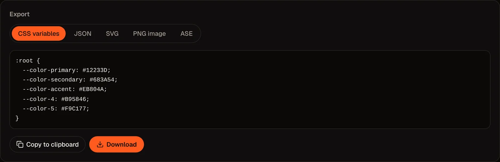
Copy the HEX, RGB, HSL or CMYK value of any color, or export the whole palette as a PNG, an SVG, CSS variables, JSON or an ASE swatch file. CMYK values are a mathematical conversion from RGB, so treat them as a starting point for print rather than an exact ink recipe. If a design app rejects the ASE file, use the CSS or JSON export instead.
A worked example
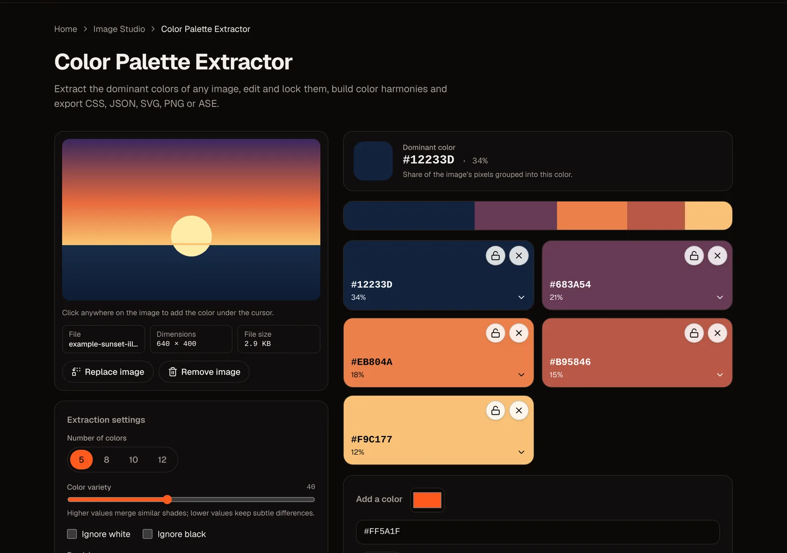
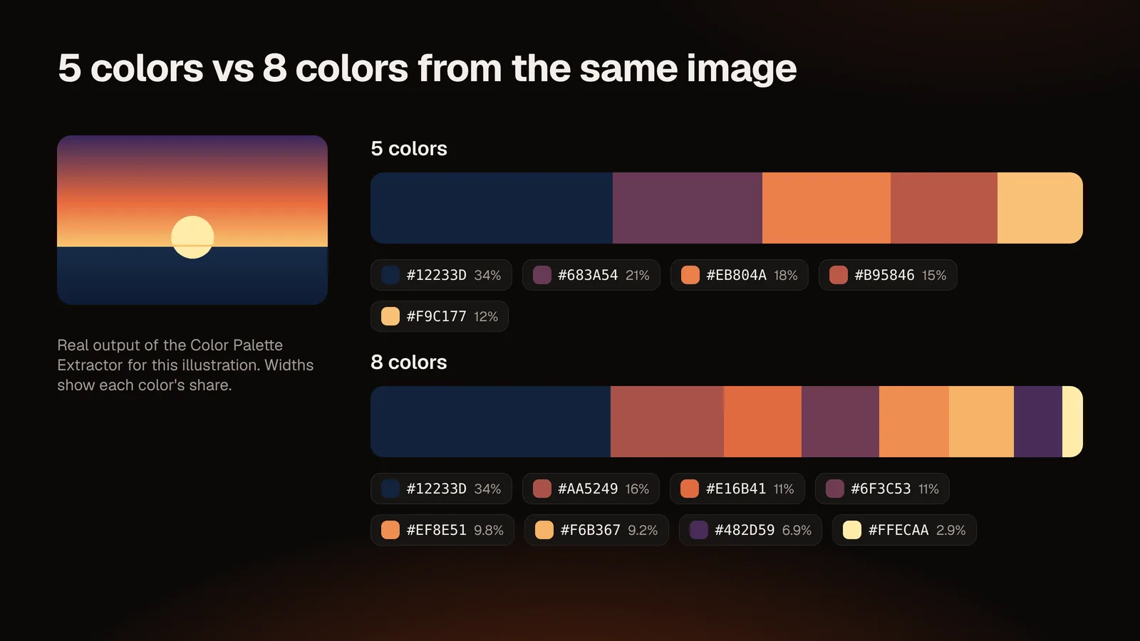
To show real numbers, we made a simple sunset illustration (640 × 400 pixels) and loaded it into the Color Palette Extractor, asking for five colors at the default settings. The tool returned:
| Color | HEX | RGB | HSL | Share of image |
|---|---|---|---|---|
| Deep sea | #12233D | rgb(18, 35, 61) | hsl(216, 54%, 15%) | 34% |
| Dusk plum | #683A54 | rgb(104, 58, 84) | hsl(326, 28%, 32%) | 21% |
| Sunset orange | #EB804A | rgb(235, 128, 74) | hsl(20, 80%, 61%) | 18% |
| Clay red | #B95846 | rgb(185, 88, 70) | hsl(9, 45%, 50%) | 15% |
| Warm sand | #F9C177 | rgb(249, 193, 119) | hsl(34, 92%, 72%) | 12% |
Treat these as one run, not a fixed answer. The tool starts each newly loaded image from a different internal starting point, so shades can shift slightly between runs of the same image (in our repeated runs the deep sea color stayed #12233D at 34% every time, while the orange, red and sand tones shifted noticeably in shade, though they stayed in the same color family). Locking the colors you like, then regenerating, is how you keep the result steady.
Asking for eight colors on the same image split the orange and plum areas into several shades each and added the small pale sun (#FFECAA, 2.9%). That is a useful lesson: more colors add detail, not importance. The sun is the focal point of the picture but only 2.9% of its area, so it comes last in an area-ranked list.
Which images give the best palettes
- Photos with a clear subject and a consistent light source produce palettes that look harmonious.
- Flat illustrations and logos return their exact colors, since there are few distinct values.
- Busy images with many unrelated colors (a market stall, a crowd) yield noisy palettes; reduce the count or crop to the area you care about first.
- Heavily compressed JPEGs contain artifacts that can add faint off-colors. Raising "variety" usually hides them.
- Images with transparency: fully or mostly transparent pixels are ignored, so a PNG logo on a transparent background gives the logo's colors.
When the palette does not look right
| Problem | Likely cause | Try this |
|---|---|---|
| Everything looks gray or muddy | Large neutral areas dominate | Turn on ignore white/black; crop; lower the color count |
| The accent color is missing | Variety is too high or the accent covers few pixels | Lower variety; add the color by clicking the image |
| Two colors look almost identical | Variety too low | Raise variety |
| Colors look different from the screen you saw | Your image has a color profile or you view on a different display | Check the image in sRGB; compare on one screen |
Turn the palette into something usable
An extracted palette is raw material. Before you use it:
- Assign roles. Decide which color is the background, which is text, which is the accent.
- Check contrast. Text on a background should reach at least a 4.5:1 contrast ratio under WCAG guidelines for normal-size text (3:1 for large text). The tool shows how each color looks on white and on black, and the optional AI consultant only suggests text/background pairs that pass 4.5:1.
- Build harmonies. Pick a base color and generate complementary, analogous, triadic, split complementary or monochromatic variations. The tool marks generated colors separately from extracted ones, so you always know which colors came from your image.
- Convert formats as needed. The Color Converter handles HEX, RGB and HSL if you need a code in another notation.
For a full method to go from palette to brand system, see How to Create a Professional Brand Color Palette.
Conclusion
Extracting a palette takes seconds; making it good takes a few decisions: how many colors, what to ignore, which ones to lock. Start from an image that already feels right, extract, tidy up and test contrast before you commit.
Ready to try it? Open the Color Palette Extractor and drop in an image. Your picture stays in your browser.
Sources and notes: WCAG contrast thresholds are from the W3C Web Content Accessibility Guidelines 2.x. Color values in the worked example come from a real run of the tool on the illustration included in assets/; your own run may differ slightly.
Questions and answers
How do I get the color palette of a picture for free?
Open a browser-based extractor such as the Color Palette Extractor, drop in the image and copy the codes. No account is needed.
How many colors should I extract?
Five for a quick mood, eight for most design work, ten to twelve when you want subtle shades. You can add or remove colors afterwards.
Is my image uploaded anywhere?
Not for extraction: the image is analyzed in your browser. The optional AI consultant, if you use it, receives only the HEX codes and an optional short note, never the image.
What do the percentages mean?
They show how much of the image's area each color group covers. A small but visually important detail can have a low percentage.
Why is the palette different from another website's result?
Different tools sample, cluster and merge colors differently. Neither result is "wrong"; adjust the variety and count until the palette matches what you need.
Can it match paint or Pantone colors?
No. The tool reports colors as HEX, RGB, HSL and CMYK. It does not look up paint brand or Pantone catalog codes, so match those with the manufacturer's tools.
Does the AI part change my palette?
No. The AI consultant is optional and only suggests a name, mood, uses and accessible pairs for colors you already extracted. All other features work without it.